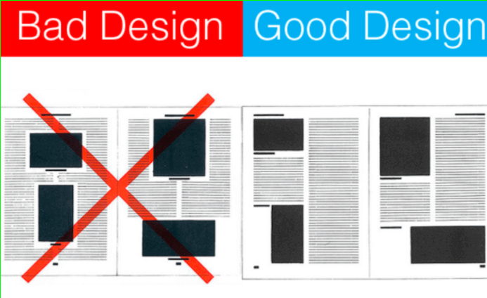
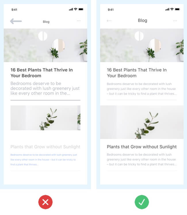
As a beginner UI designer, it’s easy to make mistakes. You’re probably making some of these mistakes right now without realizing it. But don’t worry, you’re not alone. Everyone makes mistakes when they’re starting in any new field. The key is to learn from your mistakes and grow from them.
In this article, we’ll look at eight common UI mistakes that beginner UI designers make. We’ll also offer some tips to differentiate between good UI vs bad UI designs.
What Is A UI Design Mistake?
UI design can be flawed in different ways. Sometimes, designers are too creative and forget that they ‘design for people’. It also happens when people do not understand how people and computers interact. However, UI designers need to be aware of these so their designs do not go wrong.
Examples of UI design- common mistake in UI design mobile make is adding too many bells and whistles to their designs. This can often clutter the screen and make it difficult for users to find what they are looking for. Another mistake is making the text too small or difficult to read. This can be very frustrating for users and may cause them to abandon the product altogether.
Examples Of Lousy UI Designs


Mistakes Beginner UI Designers Make
Designing for people is not as easy as it seems. Even the most creative and innovative UI designers can make mistakes that lead to unusable and unappealing designs. Some of the most common mistakes beginner UI designers include:
- Focusing on looks rather than usability: When it comes to UI design, it’s important to spot the difference between good UI vs bad UI. The primary goal of a good UI design in mobile should be usability. Your design should be clear and easy to understand, simple and easy to use, and consistent with other designs on the page or screen. If your design violates any of these principles, it will likely be difficult for users to use and may even confuse them.
- Not paying attention to detail: When UI designers don’t pay attention to detail, their designs can often be cluttered and disorganized. Additionally, font choice, color choice, and layout can significantly impact usability. If you’re not careful, small details can easily throw off the balance of your design and make it difficult for users to navigate.
- Not testing designs before launch: One of the best to identify the difference between good UI vs bad UI is testing. When you don’t test your designs, you risk releasing a product that is difficult to use, looks unprofessional, or doesn’t work correctly. Additionally, you may not be able to catch any potential usability problems or design flaws before your product goes live. This can lead to much negative feedback from users and even cause your product to be abandoned without making it through the testing phase.
- Not taking user feedback into account: When UI designers don’t accept user feedback, they can end up designing something that is difficult to use or doesn’t meet users’ needs. Additionally, they may not be able to get an accurate idea of what users want or need. This can lead to designs that are not as effective or efficient as they could be. Additionally, it can cause frustration and dissatisfaction among users.
- Not keeping up with current trends: When UI designers overlook trends, their designs can quickly turn into outdated or bad UI designs. Additionally, they may not be aware of the latest design trends and techniques, which can lead to designs that are not as effective or efficient as they could be. And they may end up creating designs that can lead to a disconnect between the creation of the product and the overall branding strategy.
- Not researching your target audience: UI, for beginner designers, needs a thorough examination of the age, cultural background, technological abilities, geographical location, and income level of the target audience to understand their needs better and wants. This will help them create more user-friendly designs and meet the needs of their target audience. Without proper research, UI designers can easily design something that is not well-received by users.
- Not using mockups: Mockups are essential for UI designers to envision the design before coding or building entirely. Seeing your designs on a computer screen and testing the application is critical for improving usability and meeting user expectations. But when they don’t use UI design tools or mockups, they risk not having a clear vision of what the end product will look like, leading to unusable, bad UI designs.
- Not following design guidelines: Most software programs, operating systems, and websites have specific design guidelines that UI designers should follow. When they don’t follow these guidelines, their designs can be challenging to use or may not look or function correctly. Additionally, not following design guidelines can make it difficult for users to navigate your website or utilize your product.
- Not using fonts and colors wisely: Fonts and colors can create a specific feeling or mood, but they can have the opposite effect when they’re not used correctly. Additionally, using too many fonts or colors can make your design look cluttered and unprofessional. When UI designers misuse fonts and colors, it produces bad UI design.
- Underestimating the power of animation: Animation can be a powerful UI design tool when used correctly, but when it’s overused or not used properly, it can negatively affect the usability of your product. Additionally, animation distracts users from important information or buttons to be clicked. When UI designers misuse animation, it can lead to usability problems and negatively affect the product’s overall design.
Remember, good UI design tools is all about finding the balance between usability and aesthetics. By avoiding these common UI mistakes, beginner UI designers can avoid costly usability problems and create beautiful and user-friendly designs.
Tips To Avoid Common Mistakes In Your Design Work
Here are a few tips on how to avoid making common mistakes in your work:
1. Plan ahead

As a UI designer, it’s your responsibility that the people using your product can use it without being frustrated or confused by anything you’ve included in the interface. That requires planning when making decisions about how something should work. If you don’t plan, mistakes like these can happen:
- People might not know where a button takes them after clicking on it because there is no indicator telling them what would happen.
- They might not be able to find the search bar because it was hidden in a corner or placed below the fold.
- They might accidentally close an app or window they were using because there was no confirmation message before closing.
2. Test, test, test:

Testing your designs before releasing them to the public can help you avoid making any last-minute changes that could impact the usability of your product.
A common misconception among designers is that they are designing a work of art, and no one will ever see it, so there’s no need to test anything. This couldn’t be further from the truth. You are designing something for someone else and therefore should have their experience in mind during development.
UI designers need to test their designs more frequently to avoid common UI mistakes. Some of the things they need to try include:
- Button placement and function.
- Navigation and usability.
- How easy it is to find specific features or information.
- How the design looks and feels on different devices.
3. Use feedback:

Feedback becomes a designer’s best friend because this helps them avoid mistakes from happening in the first place. It also makes revisions much more accessible, which is necessary when testing your work before releasing it to the public.
UI designers need to consider who they’re getting feedback from and whether or not that feedback is helpful. They also need to make sure that they’re not only regarding the opinions of people already familiar with the product. It’s essential to get feedback from various sources, including people who don’t usually use the product, to get a more accurate idea of how well the design works.
Ideally, UI designers should aim to get feedback from a wide variety of people, including:
- People who are new to the product.
- People who are familiar with the product.
- who don’t usually use the product.
- Experts on the subject matter.
4. Stay up to date

The design industry is constantly evolving, and as a UI designer, it’s essential to stay current with the latest trends. That doesn’t mean you have to adopt every trend that comes along, but it’s helpful to be aware of them to make better decisions about approaching your designs.
Some common trends in UI design include:
- Flat design.
- Minimalism.
- Use of typography.
- Use of color.
- Interactive design.
Many resources are available to help UI designers improve their skills, including online tutorials, books, and even conferences. It’s also helpful to join communities of designers who can share tips and advice.
5. Ask for help

No one knows everything, and as a UI designer, you will need help occasionally. It’s ok to ask for help from others in your field or even people who aren’t experts in design. All it takes is a willingness to learn and accept feedback.
By following these tips, you’ll be able to avoid some of the most common UI mistakes made by beginner UI designers.
Resources For Learning More About UI Design
If you’re interested in learning more about UI design and how to get better at it, here are some resources that you might find helpful:
- The Nielsen Norman Group: This website is packed full of information on all things usability, including UI design. It’s an excellent resource for beginners and experienced designers alike.
- Smashing Magazine: This website is an excellent resource for design topics, including UI design. It has lots of tutorials and articles to help you improve your skills.
- Google Design: This website is devoted to helping designers create beautiful, user-friendly designs. It has many resources, including tutorials, case studies, and toolkits.
Conclusion
It can be tempting to design a product without differentiating between good UI vs bad UI and end up doing blunders. But if you are not mindful of these things as a UI designer, there’s always a chance that your design won’t work for some people and could lead to wasted time or money.
When developing new products in the digital world, remember: usability matters more than creativity when designing interfaces! To avoid making mistakes yourself and improve your skill set, apply the tips mentioned in this article. We hope it helps you become a successful UI designer.
Related Blog – The basic HTML tags for beginners

